

Let’s confront a common bias.
In many contemporary projects, color is treated as decoration—applied at the end of the design process.
That approach is fundamentally flawed.
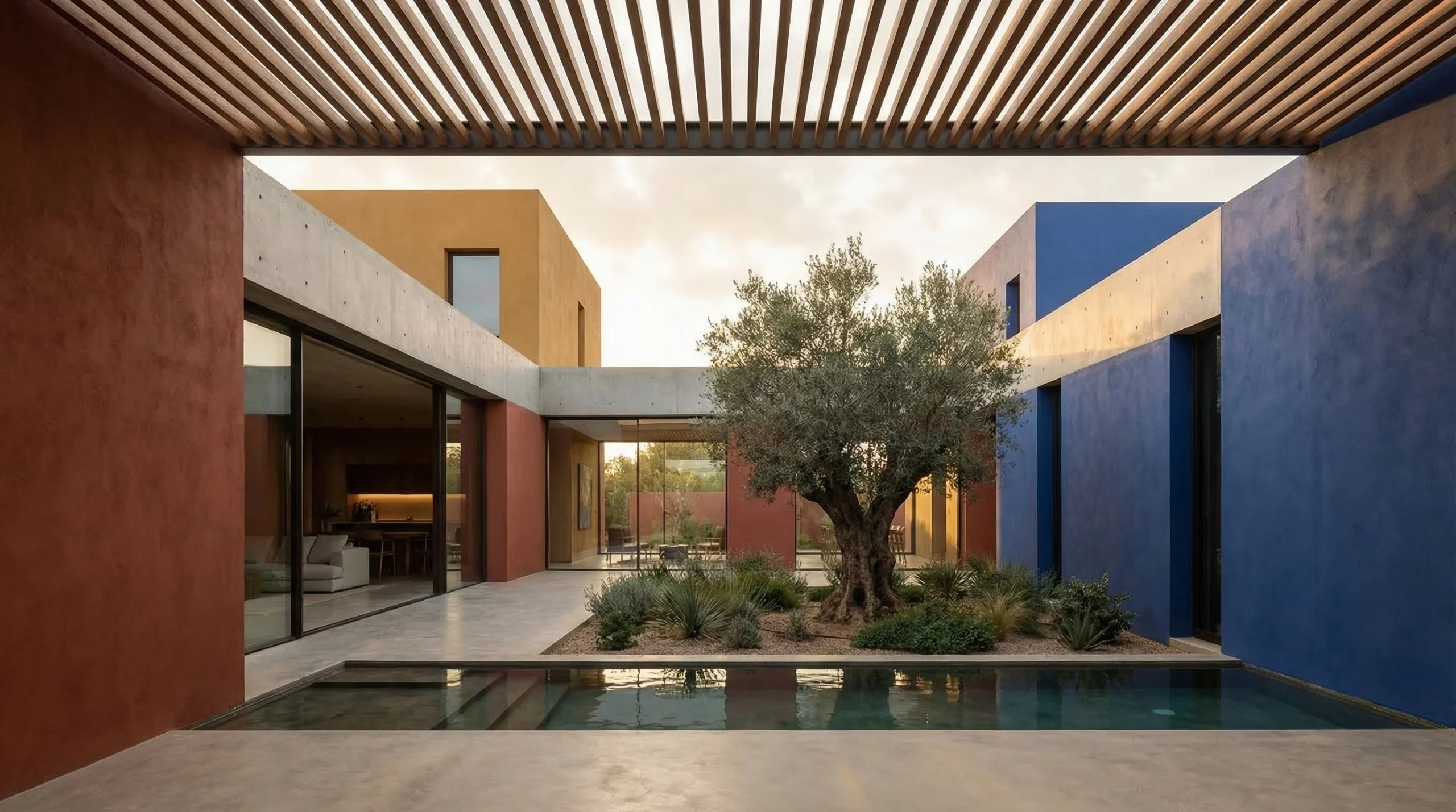
Mexican architecture, particularly in modern interpretations, demonstrates that color is not an accessory—it is a primary spatial tool.
When combined with light and form, it shapes:
- Emotional response
- Spatial perception
- Behavioral interaction
The real lesson is not about vibrant palettes.It is about how color and light are used to construct experience.

1. Color as Spatial Definition, Not Surface Treatment


In Mexican architecture, color defines space before walls do.
First-Principles Breakdown:
- Color influences depth perception and spatial boundaries
- High-contrast colors create visual separation
- Monochromatic zones create cohesion
Strategic Translation:
- Use color to differentiate zones instead of relying only on partitions
- Apply bold planes to define edges, transitions, and focal points
- Avoid random color application—every color must serve a spatial role
Design Insight:
Color is not applied to space.It creates space.
2. Light as a Dynamic Partner to Color

Color in Mexican architecture only works because of its relationship with light.
First-Principles Breakdown:
- Natural light changes throughout the day
- Color reacts differently under varying light conditions
- Shadow adds depth and contrast
Strategic Translation:
- Design openings to control how light interacts with colored surfaces
- Use indirect light to soften intense colors
- Create moments where light and color evolve over time
Design Insight:
Light transforms color into a temporal experience—not a static visual.
3. Emotional Zoning: Designing How Spaces Feel
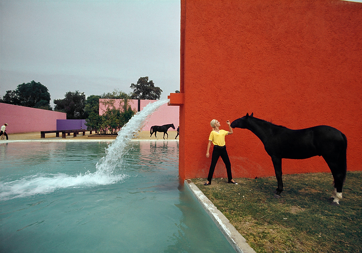
Mexican architecture uses color and light to create emotional gradients within a project.
First-Principles Breakdown:
- Colors trigger psychological responses
- Warm tones energize; cool tones calm
- Spatial transitions influence emotional rhythm
Strategic Translation:
- Assign colors based on desired emotional function of each space
- Transition between tones to guide user experience
- Avoid uniform emotional environments across the project
Design Insight:
Good architecture does not just organize space.It orchestrates emotional states.
4. Minimal Form, Maximum Impact
Mexican architecture often uses simple geometric forms—but amplifies them through color and light.

First-Principles Breakdown:
- Simplicity enhances clarity
- Fewer elements increase visual impact
- Strong contrasts create memorability
Strategic Translation:
- Simplify forms to allow color and light to dominate
- Avoid unnecessary complexity that dilutes experience
- Use geometry as a canvas for sensory interaction
Design Insight:
Complexity does not create impact.Precision does.
5. Thresholds and Framing: Directing Perception

Mexican architecture carefully frames views, colors, and light transitions.
First-Principles Breakdown:
- Humans focus on framed elements
- Transitions enhance spatial awareness
- Contrast directs attention

Strategic Translation:
- Use openings to frame color and light compositions
- Design thresholds as moments of transition, not just passage
- Control visibility to create anticipation
Design Insight:
Architecture is not just space.It is what you reveal and what you withhold.
6. The Critical Failure in Contemporary Design
Here’s the issue.
Most modern architecture:
- Treats color as secondary
- Over-relies on neutral palettes
- Ignores emotional impact
This leads to:
- Visually safe but emotionally flat spaces
- Lack of identity
- Weak user engagement
The Core Problem:
Design is driven by aesthetic caution instead of experiential intention.
Mexican architecture proves that bold, controlled decisions create stronger spaces.
7. Strategic Application for Modern Practice
The goal is not to replicate Mexican aesthetics.It is to adopt the strategic use of color and light.
Actionable Strategies:
- Integrate color decisions from the concept stage, not the end
- Design light paths that interact with surfaces dynamically
- Use color to define function, hierarchy, and emotion
- Simplify form to amplify sensory experience

Competitive Advantage:
Architects who master color and light can:
- Create memorable spaces
- Enhance emotional engagement
- Differentiate their work in a saturated market

Conclusion
Mexican architecture is not about vibrancy. It is about intentional emotional design.
Color defines space.Light transforms it.Form supports it.Transitions amplify it.
Together, they create architecture that is not just seen—but felt.
If modern architecture wants to evolve, it must move beyond neutral safety and embrace experiential intensity with control.
Call to Action
Architecture reaches its highest value when it connects emotionally with its users.
If you want to translate principles like color-driven zoning, light orchestration, and experiential design into high-performance modern architecture—Graphite is building that bridge.
Connect with Graphite to move beyond visually safe design and into emotionally intelligent architecture that truly resonates.